Brand: Purrfeto
Project Type: Advertising Film / Branded Content
Production Design & Art Direction: Set Craft
Production Designer: Gautam Kumar
Status: Completed
Images: original film stills from the completed Purrfeto advertising films. Production design: Set Craft. Watch both films below to see the environment in motion.
A purple set designed to hold multiple stories
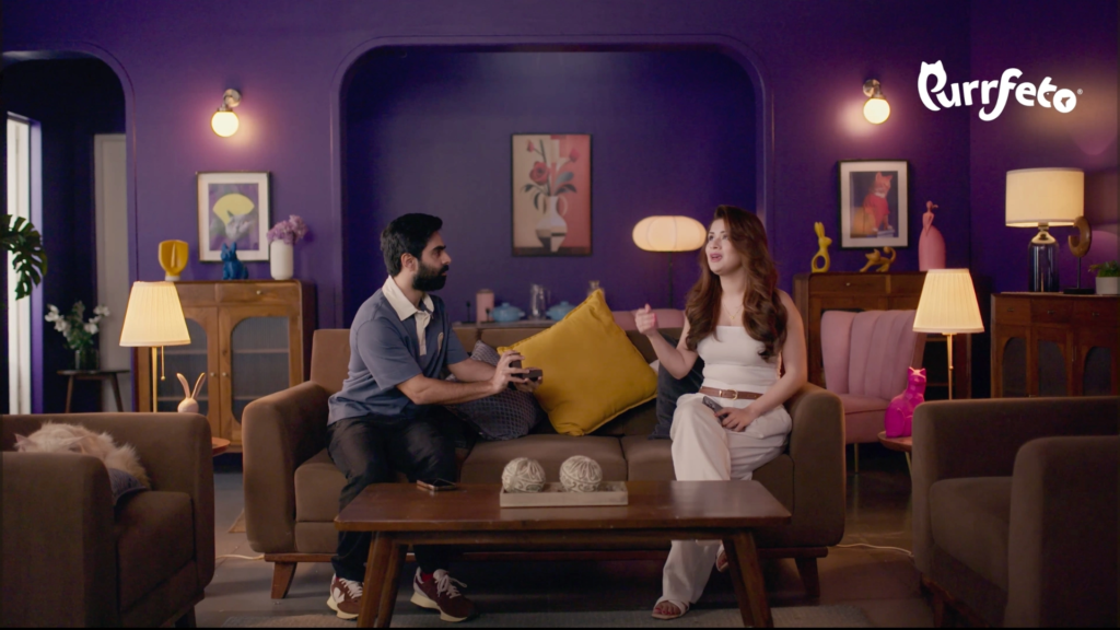
For this Purrfeto advertising film set design project, the central production-design idea was to create a single living-room environment with a strong enough identity to remain recognisable across multiple character beats, costume changes and comic situations.
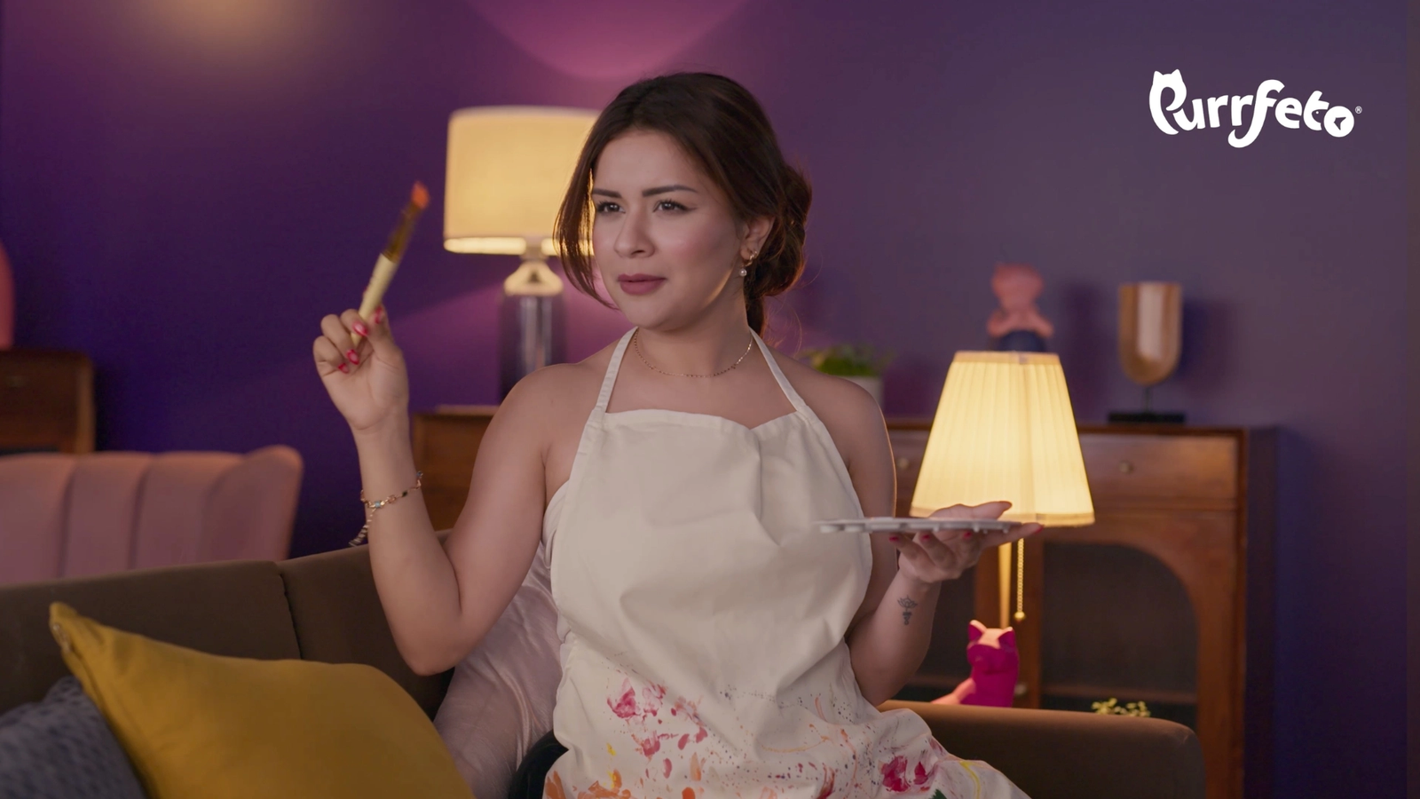
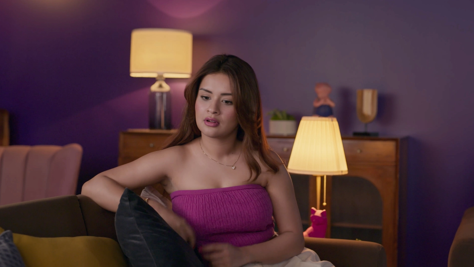
The room is built around a deep purple and plum visual field, softened with warmer timber furniture, brown upholstery, blush seating, mustard cushions and warm practical lamps. Instead of treating purple as a flat wall colour, the set uses tonal variation, curved openings, recessed zones and practical light to create depth within the same colour family.
The result is a frame that feels graphic and memorable without becoming one-note. It gives the performers room to change personality and action while the environment continues to anchor the campaign.
Why purple works on camera
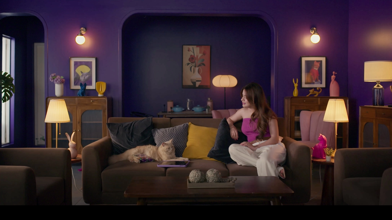
Purple is a high-character colour. Used carelessly, it can flatten into a large dark surface or overpower skin tones and wardrobe. Here, the production design avoids that by using several supporting layers rather than asking one colour to do all the work.
- Deep violet and plum establish the dominant background identity.
- Warm brown timber tones introduce natural material contrast.
- Mustard and muted yellow create a complementary warm accent against the purple field.
- Blush and dusty pink bridge the gap between the cool wall colour and warmer skin tones.
- Ivory practical lamps create warm pools of light that break the darker background into readable zones.
This is less about choosing a “purple palette” and more about building a controlled colour hierarchy. The purple gives the set its identity, while the timber, amber light, mustard and blush prevent the frame from becoming visually heavy.
Architecture within one colour family
The living room is organised around a central recessed arch, with smaller rounded openings and wall breaks on either side. Because these architectural shapes remain within the purple family, they add depth without introducing another competing colour.
The larger central opening creates a visual frame inside the frame. The wall sconces mark the edges, the central artwork gives the recess a focal point, and the furniture below establishes a second horizontal layer. From a wide camera position, the room reads as a complete environment rather than a decorated backdrop.
The curved corners are particularly useful because they soften the geometry of the room. Against a darker monochromatic wall treatment, hard rectangular openings could have made the set feel architectural and static. Rounded corners keep the world playful and help the background sit naturally behind the performers.
Warm practical lighting against a cool-purple world
The practical lamps do more than decorate the room. Their warm amber light creates separation between foreground, performer and background. Table lamps, floor lamps and wall sconces repeat the same warm visual note across the set, giving the eye multiple points of brightness inside an otherwise deep palette.
This warm-versus-cool relationship is useful in advertising-film production design because it gives the cinematography something to work with before additional film lighting is introduced. The practicals create believable light sources in the environment while also helping furniture, faces and props separate from the purple walls.
One set, multiple character identities
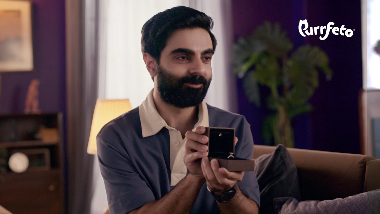
A major strength of the environment is how easily it supports different character transformations. Across the films, the same room accommodates fashion-led looks, professional personas, comic props and activity-based moments without needing to rebuild the background each time.
A trench coat, chef uniform, laboratory look, guitar, magnifying glass, laptop or art prop changes the immediate character read, while the purple set remains stable. That consistency gives the campaign a recognisable visual home.
For production design, this is an efficient way to work: instead of creating multiple unrelated rooms for each gag or personality shift, one carefully designed environment becomes a repeatable stage. The set absorbs wardrobe and prop changes while still feeling intentional in every frame.
Set dressing that supports the pet category without becoming literal
The room includes playful sculptural objects, framed graphics, rounded lamps, plants and small decorative forms. Some details quietly echo the pet world without turning the entire environment into themed décor.
That restraint matters. The brand and the cat need to remain the primary category cues. The set dressing supports the tone through shape, colour and personality rather than filling every surface with obvious pet references.
In the product shot, the mint-toned Purrfeto pack and the cat sit against the darker brown sofa, with charcoal, grey and mustard cushions behind them. This gives the product useful colour separation while keeping it inside the same visual world established by the wider room.
Designing for both wide shots and close frames
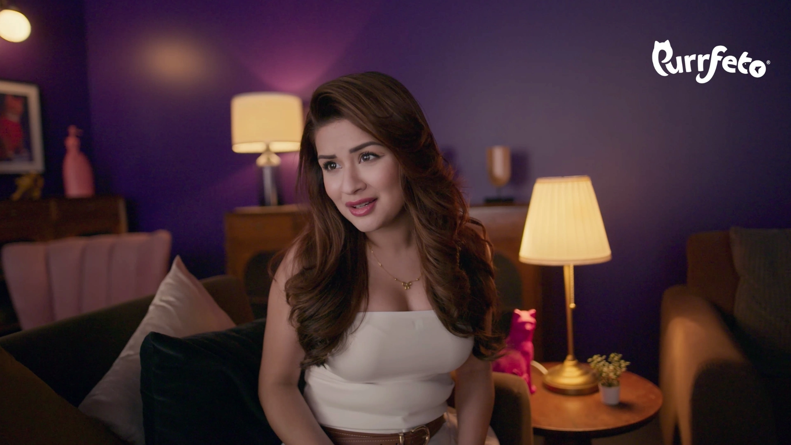
The wider compositions rely on the full architectural rhythm: central sofa, recessed arch, flanking cabinets, practical lamps and side seating. In medium and close frames, only fragments of that system remain visible — a lamp, a timber cabinet, a mustard cushion, a blush chair or the purple wall.
That is why the colour relationships need to work at more than one scale. A good advertising-film set should still feel identifiable when the camera moves closer and most of the room disappears.
Here, purple acts as the visual constant. Even in tighter character frames, the background colour and warm practicals make the image immediately belong to the same campaign.
Colour as a production-design tool
Colour in production design is not only about making a frame attractive. It can establish hierarchy, separate the performer from the environment, connect props and furniture, and give a campaign a visual memory.
For this Purrfeto project, the purple set works because it is supported by a complete system: tonal walls, curved architecture, warm timber, practical lamps, mustard accents, blush upholstery and restrained set dressing. None of those elements carries the frame alone; together they create a distinctive advertising-film environment.
Explore another Purrfeto production-design project by Set Craft, see more advertising-film production design projects, or learn about our advertising film production design and set design services.
Planning an advertising-film set?
Set Craft develops production design, set design, art direction and set dressing for advertising films and branded content in Mumbai and across India. If you are developing a commercial, share the script, references, location, production dates and indicative scale through our project enquiry page.