Set Craft Atelier · Design study & planning
Grounded Calm is a concept study explored through five visualisations. These are design proposals, not photographs of a completed interior. Materials, dimensions and construction details remain to be developed and tested.
How can a warm neutral living room feel composed without becoming anonymous? This Set Craft Atelier study examines that question through ivory seating, terracotta accents, pale timber tones and rounded forms. Across five variations, the palette stays recognisable while the layout, wall treatment and object arrangement change. The purpose is to understand which decisions create calm, which introduce character, and which need further planning before a room can function beyond the image.
Design intention: calm with a clear point of interest
The central move is to give the largest surfaces the quietest colours. Pale walls, upholstery and curtains form a continuous background. Terracotta then works as a selective accent: an architectural recess, a chair, a cushion or a piece of artwork. This difference in visual weight makes the room legible before its smaller details are noticed.
Our reading is that the scheme works best when one feature leads. A strong niche needs fewer competing objects; a simpler wall can carry a more expressive artwork arrangement. Repeating every curve and colour everywhere would weaken that hierarchy. Calm comes from deciding what deserves attention and allowing the rest to support it.
Living room layout: compare the arrangements, not just the styling
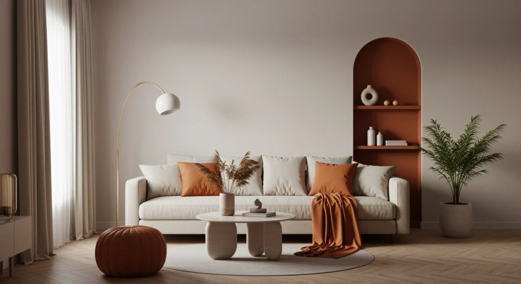
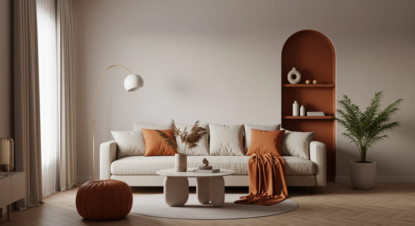
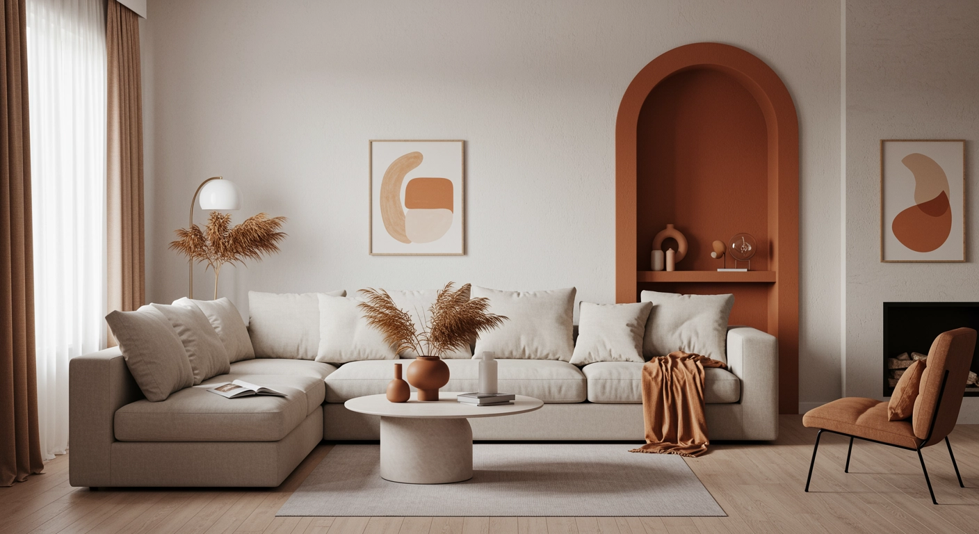
The straight-sofa variation with a low rounded table and separate pouffe keeps the central composition open. Its asymmetrical niche gives the wall an architectural anchor without centring every element. In the sectional variation, the return of the sofa defines a more enclosed seating zone. That can strengthen conversation, but it also occupies more floor area and makes the route around the coffee table a critical planning question.
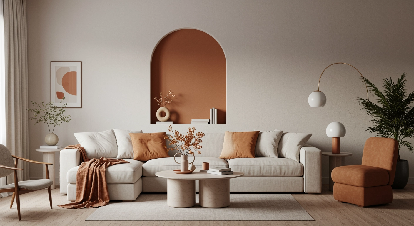
A third option combines the sectional with a substantial terracotta chair. This introduces an opposing seat and a stronger foreground, although the chair’s position should be tested for comfortable conversation rather than chosen only for a frontal view. The later straight-sofa studies use lighter independent furniture and a flatter wall treatment. They suggest a more adaptable arrangement, with character carried by objects rather than a built recess.
These are alternative compositions, not verified views of one resolved plan. Before selecting a layout, we would map doors, windows, circulation, seating capacity and furniture footprints. The images cannot establish clearances or room dimensions.
A terracotta and ivory palette with controlled contrast
Ivory and warm off-white occupy the broadest areas. Clay, rust and caramel appear in smaller, more concentrated patches. Pale wood tones connect the floor to the warm accents, while green foliage introduces a cooler contrast at the edge of the arrangement.
The colour study is more useful as a relationship than as a fixed paint recipe. A terracotta niche reads differently beside a cream wall than the same colour on a textured cushion. Physical samples would need to be compared together under the actual daylight and evening lighting. For a shoot, wardrobe and product packaging would also influence how much orange or brown belongs in the frame.
Arched niche or wall art: where should the identity live?
The arched recess gives the wall depth and makes terracotta part of the architecture. Its shadowed edges create a stronger focal point than a flat painted patch. In the first variation, shelves break that depth into small stages for objects; in another, the larger single recess creates a quieter backdrop above the seating.
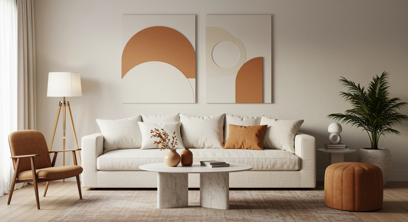
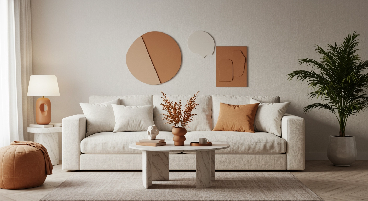
The artwork-led alternatives achieve a related colour rhythm without a niche. Paired rectangular panels feel more ordered; separate circular and relief-like forms introduce an informal balance. These directions should be evaluated against the brief. A permanent interior may justify construction work, while a temporary shoot environment may benefit from a removable scenic element or artwork treatment. Neither approach should be specified from a visualisation alone.
Material thinking: softness needs something to push against
The visuals suggest woven upholstery, textured walls, timber flooring and pale stone-like tables. These descriptions identify an intended appearance, not confirmed products. Their value is in the contrast: soft seating against a harder table, fine wall texture against clearer floor lines, and matte surfaces interrupted by small reflective lamp details.
A tightly coordinated neutral scheme can become flat if every finish has the same texture. Conversely, too many strong grains and patterns compete with the room’s focal feature. We would develop a restrained sample board, then test cleaning, wear, edge details and fabrication appropriate to the intended use. A residential room and an advertising set have different practical demands.
Prop arrangement: fewer groups, stronger relationships
Books create low horizontal bases. Vases and stems introduce height. Lamps connect furniture to the surrounding wall, and throws soften the boundaries of otherwise structured seating. The useful principle is grouping by role rather than filling every available surface.
The taller central arrangements are visually expressive but deserve a practical edit. In a conversation area they may interrupt sightlines; in a shoot they may obscure a face or compete with a product. Lower stems, an offset vase or a clearer tabletop could retain the palette while making the setup more usable. Props should help communicate a particular inhabitant or brand story, rather than remain a collection of interchangeable decorative objects.
Lighting and composition for a shoot environment
The visualisations suggest broad light arriving from the left, softened by curtains. This reveals upholstery and wall texture without relying on hard contrast. Floor and table lamps add recognisable domestic cues, although their appearance does not establish a working lighting plan.
For filming, we would test the setup through the intended lenses and camera positions. The sofa, table and wall feature need to work in wide shots and closer coverage. Reflective shades, bright window areas and pale upholstery should be checked with the cinematographer. A convincing brand environment also leaves space for performers, product placement, crew access and continuity between takes.
From visual study to a workable design
- Define the use: residential living, a temporary shoot set or a branded environment, with a clear audience and practical brief.
- Resolve the plan: survey the space and test circulation, seating, access and, where relevant, camera coverage.
- Select one focal strategy: architectural niche or artwork-led wall, supported by a restrained colour hierarchy.
- Validate finishes: review physical samples, upholstery, floor treatment and table construction within the budget.
- Edit the dressing: retain objects that support the story, sightlines and intended activity.
- Test before execution: review lighting, mock-ups, fabrication details and installation requirements.
The direction we would take forward is a quiet ivory foundation with one terracotta focal element, limited sculptural dressing and a layout chosen for use. The strongest outcome will come from resolving those relationships, not reproducing every object in a reference image.
Developing a space with Set Craft Atelier
Explore Set Craft Atelier for our design studies, or see how art direction and set dressing shape environments for the camera. For a shoot setup or brand environment, share your brief with Set Craft, including the intended use, location, timeline and budget range. This study is a starting point for a project-specific conversation.
Continue exploring Set Craft